-8")


Have you ever wondered why some wedding photographs instantly capture your attention while others fall flat? The key often lies not in expensive gear or technical perfection, but in the thoughtful application of color. As wedding photographers, our ability to understand and work with color can transform ordinary scenes into memorable keepsakes that couples will treasure forever!
Table of Contents
- Introduction to Color Theory in Photography
- Fundamentals of Color Theory
- Psychological Impact of Colors
- Color Theory in Current Wedding Photography Styles
- Color Schemes and Harmony in Photography
- Practical Uses in Wedding Photography
- Editing with Color Theory, Advanced Techniques
- Common Errors and How to Avoid Them
- Ways to Improve Your Color Skills
- Conclusion
Introduction to Color Theory in Photography
Color theory in photography is much more than knowing your reds from your blues, it is about understanding how colors interact, influence feelings, and create visual harmony in your images. Learning the principles of color theory can transform your work into something far more intentional and effective!
For wedding photographers specifically, color theory offers a way to capture the atmosphere of each unique celebration. Whether it is the warm, happy glow of golden hour portraits or the calm, refined feeling of an evening reception, color shapes the story we tell through our lenses.
At its core, color theory explores how we perceive different hues and how they work together to create visual interest. By intentionally selecting and working with colors in your wedding photography, you can highlight the happiness, tenderness, and celebratory spirit of the day in ways that connect deeply with couples and their families.
Fundamentals of Color Theory
At its simplest, color theory is a way to explain how humans perceive color and how colors interact with each other. The center of color theory is the color wheel, a circular arrangement of colors that shows their relationships. The traditional color wheel has 12 colors, three basic colors (red, yellow, and blue), three secondary colors (created by mixing two basic colors), and six third-level colors (created by mixing basic and secondary colors).
When working with digital images, it is helpful to understand that your camera and editing software use the RGB color model (red, green, blue), which differs slightly from the traditional RYB model painters use. In RGB, these three colors combine in different ways to create all the colors you see in your photography.
The language of color extends beyond just hues. Terms like tint (color mixed with white), shade (color mixed with black), and saturation (color strength) give us precise ways to talk about and work with color. Understanding these concepts allows you to adjust the feeling of your wedding images with subtle shifts rather than big changes.
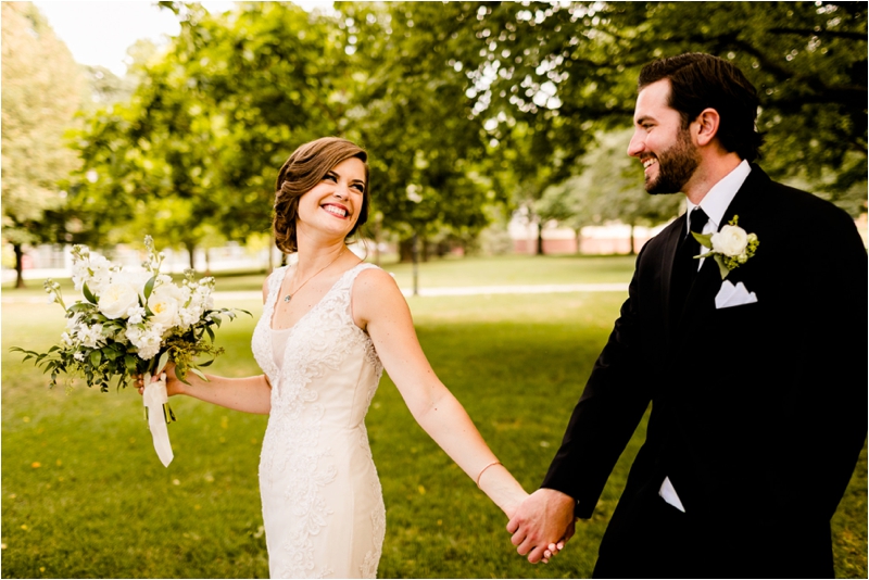
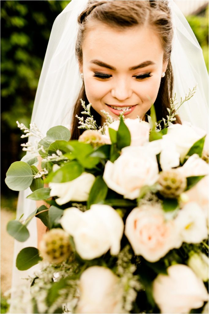
For wedding photography, knowing these fundamentals helps you make purposeful choices. For example, knowing that a blue background will make a bride’s blush bouquet stand out well because they are complementary colors is a way to tell a story!
Psychological Impact of Colors
Understanding the psychological impact of colors gives wedding photographers a wonderful storytelling advantage. Colors convey a universal message of feeling that can change how couples experience their wedding images.
Warm and Cool Colors
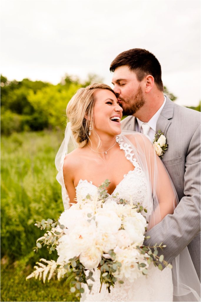
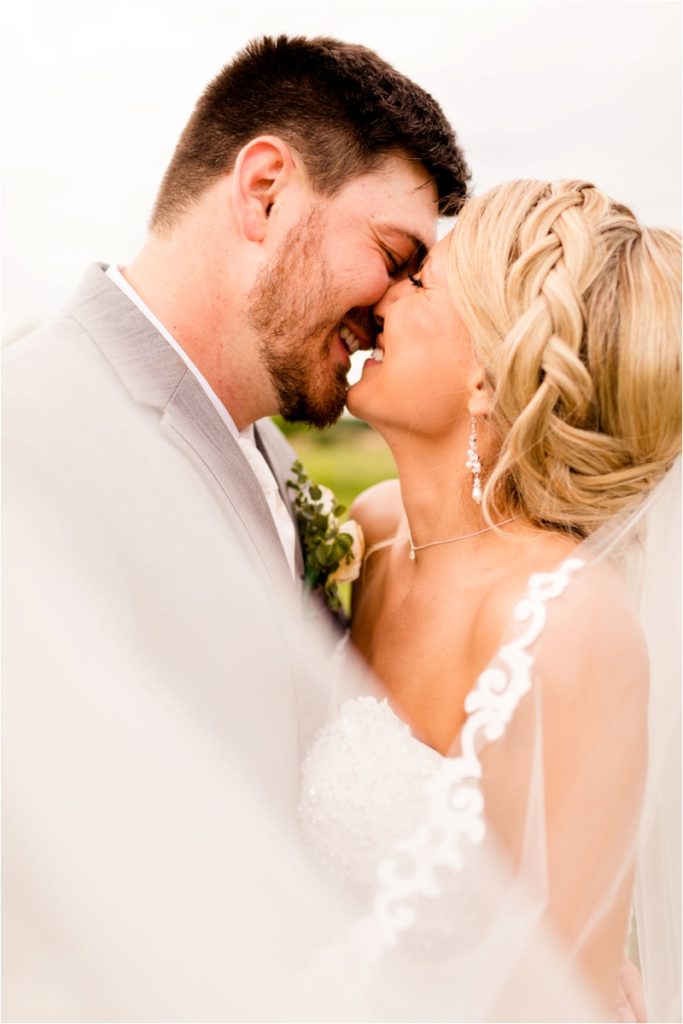
Research has shown that warm colors like red, orange, and yellow bring out sensations of excitement, passion, and energy in viewers. These colors create a feeling of intimacy, comfort, and warmth that can be particularly good for wedding photography, especially when shooting during golden hour. In contrast, cool colors such as blue and green tend to produce feelings of calmness, trust, and pleasant quietude, according to color psychology studies.
Brightness and Saturation
Interestingly, research by Valdez and Mehrabian discovered that brightness and saturation have much greater effects on viewers’ responses than the actual hue of a color. This finding is particularly useful for wedding photographers who need to consider not just which colors to include, but how bright and saturated those colors appear in their final images.
Each color brings its own feeling associations to your photographs,
- Red captures passion and excitement, ideal for highlighting romantic scenes or lively dance floor moments.
- Blue conveys tranquility and trust, making it great for contemplative preparation shots.
- Green connects us with growth and new beginnings, which can beautifully support the start of a couple’s journey together.
The most successful wedding photographers do not just capture colors, they arrange them to support the story of the day. When a couple looks at their album and says, “These photos make me feel exactly how I felt that day,” that is often the outcome of thoughtful color choices that increase genuine feelings.
Color Theory in Current Wedding Photography Styles
Today’s wedding photography is defined by distinct color ways that have become recognizable styles themselves. Understanding these trending looks and their color theory foundations gives photographers good ways to deliver exactly what couples are looking for!
Single-Hue Palettes, Grace Through Simple Looks
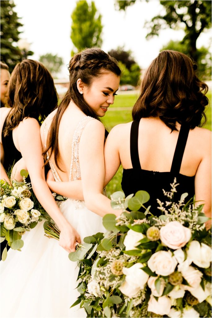
One of the most popular current trends employs single-hue color schemes using variations of a single shade, soft blushes and faded peaches, deep greens and sage, or blue-gray tones.
According to color theory experts, “Understanding color theory has helped my photography at both stages, taking pictures and processing them. A single-hue color scheme creates a feeling of togetherness in photos and makes them easy on the eyes of the viewer.”
This approach creates visual harmony and togetherness that expresses calmness, grace, and timelessness. Wedding photographers are using this technique to help subjects stand out naturally while keeping a feeling of tranquility throughout the image collection.
Pairs That Complement, Active Visual Purpose
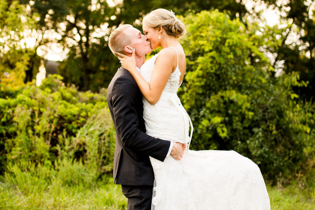
Another major trend uses complementary colors, those opposite each other on the color wheel, to create lively, attention-grabbing images. Popular combinations include sage green with soft pink, navy blue with warm peach, and terracotta with teal.
These pairings provide good contrast and vibrant visual purpose, making imagery pop while maintaining balance. The purposeful connection between opposite colors catches attention and gives energy to the composition, while still feeling balanced. This approach supports strong storytelling and strengthens feeling in wedding portraits!
Earthy and Soft Tones, Grounded Believability
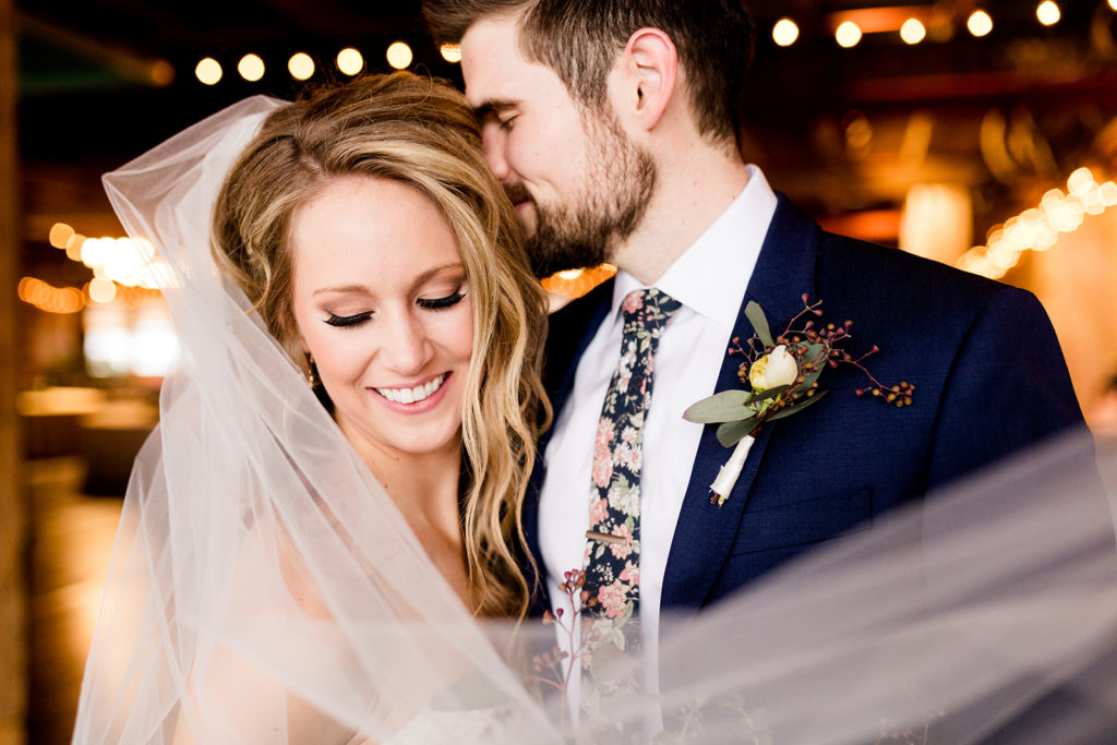
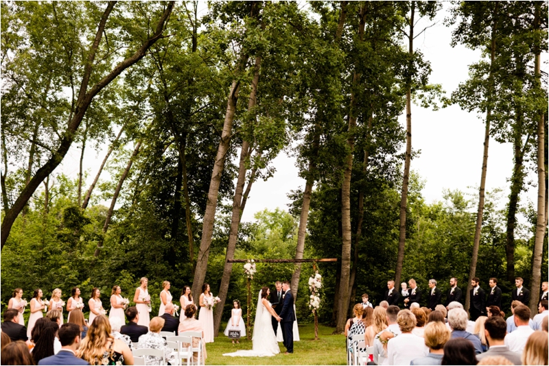
The movement toward earthy, soft tones represents a notable departure from the bright, high-contrast editing styles of previous years. Today’s couples often request terracotta, ochre, dusty rose, olive, sage, taupe, and soft browns that create subtle visual harmony and a grounded, natural feel.
These palettes bring out feelings of warmth, comfort, and approachability. They connect visually with nature-inspired venues and can give a natural or rustic feeling to wedding photos. This trend comes from similar color schemes (neighboring hues on the color wheel) and soft versions of traditional colors.
Color Schemes and Harmony in Photography
Creating appealing wedding images is not about finding fine scenes, it is about understanding how to use color schemes to make those scenes better and evoke specific feelings. Color schemes provide a structured way to select and combine colors that work well together.
Let us share some examples that show how effective these schemes can be in wedding photography,
Complementary Color Schemes
When photographing a bride in a white dress against rich green foliage, you are using a complementary color scheme (red-green, with white as a tint of red) to make her stand out well from her surroundings. This creates a point of interest that naturally draws the viewer’s eye exactly where you want it, to the bride!
Analogous Color Schemes
Using colors that sit next to each other on the color wheel creates a feeling of harmony and togetherness. Think of those dreamy golden hour portraits where the warm sunlight surrounds the couple in amber tones, supported by similar warm-toned florals and attire. The outcome feels peaceful and lovely because the colors naturally flow together.
Single-Hue Schemes
A reception bathed entirely in blue uplighting creates a unified atmosphere while focusing on texture and form. This approach is not limited to a single exact color, variations in tint and shade create depth while keeping harmony.
For couples who want vibrant, energetic images, triadic color schemes, three colors evenly spaced around the color wheel, create a balanced, yet dynamic composition that feels full of liveliness!
Understanding color harmony does not mean forcing unnatural color combinations into your wedding photography. Instead, it means becoming attuned to existing color chances and knowing how to enhance, balance, or focus on them to create images that truly connect with the feeling of the day.
Practical Uses in Wedding Photography
Understanding color theory transforms how you approach every wedding shoot, giving you a powerful way to create images that not only look beautiful but also effectively communicate feeling and purpose.
Engagement Sessions, Creating Visual Connection
For engagement shoots, placing subjects against complementary colored backgrounds creates natural visual connection that makes them stand out, like positioning a couple against autumn leaves where their blue attire appears well against the orange and red leaves.
Wedding Preparations, Setting the Feeling
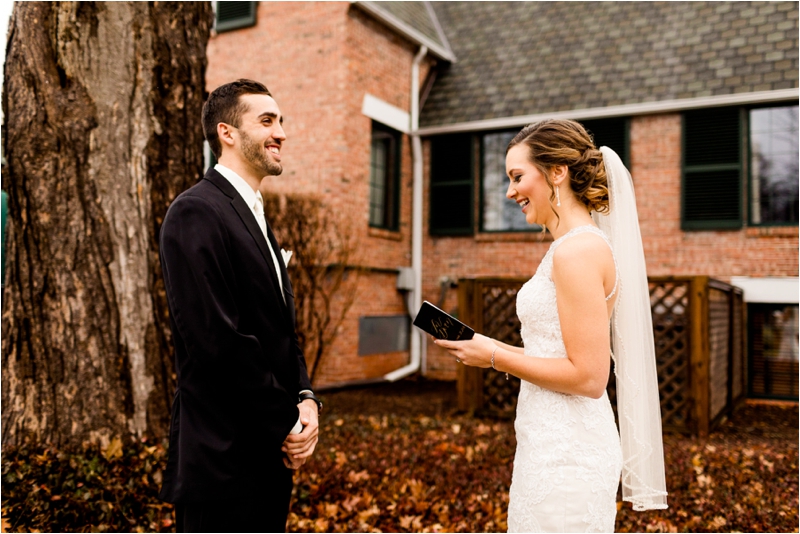
During wedding preparations, photographers often look for analogous color schemes that create a feeling of calmness and intimacy. The soft pinks, peaches, and creams found in bridal details naturally work together to create harmony that reflects the tender scenes unfolding.
Golden Hour Portraits, The Ideal Color Opportunity
The practical wonder of color theory becomes especially clear during golden hour portraits. This is a picturesque time to shoot, it is when color theory aligns perfectly with natural conditions. The warm golden light creates a natural split-complementary color scheme when paired with blue skies and green landscapes, producing portraits with depth, dimension, and inviting warmth that couples instantly connect with!
Reception Photography, Managing Artificial Color
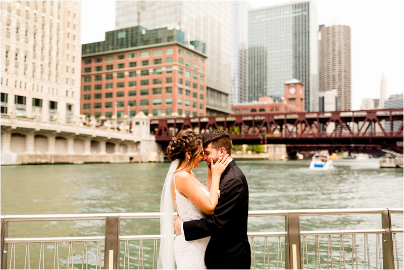
For reception photography, understanding how colors interact with various lighting conditions becomes important. The purple uplighting that looks fine to the eye might photograph completely differently if not balanced properly. Knowing how to work with these artificial color environments, either embracing them for strong impact or neutralizing them for classic timelessness, gives you flexibility in delivering exactly what your couple desires.
Editing with Color Theory, Advanced Techniques
Post-processing is where color theory truly comes to life in wedding photography. Understanding color theory transforms editing from a technical process into a creative one, allowing you to enhance the feeling in your images while maintaining their realistic quality.
White Balance as a Feeling Tool
The basis of color-aware editing begins with getting white balance right. This is about setting the feeling temperature of your image. A slightly warmer white balance can enhance the intimate feeling of preparation photos, while a cooler balance might better capture the crisp elegance of an outdoor ceremony.
HSL, The Good Way to Edit Color
HSL (Hue, Saturation, Lightness) adjustments are perhaps the most useful color editing ways available to wedding photographers. Rather than making global changes, HSL panels allow you to focus on specific colors,
- Is the bridesmaid’s dress competing with the bride? Softly reduce the saturation of that particular hue.
- Do you want the floral arrangements to appear without overwhelming the scene? Slightly increase just those specific colors.
Color Grading for Feeling and Depth
Top wedding photographers use detailed color grading techniques to create unified, feeling-filled wedding albums. Here is a step-by-step approach to achieving a cinematic orange-teal look that flatters skin tones while deepening backgrounds,
- In Lightroom, open Camera Calibration.
- Set the Blue Primary Hue slider to -100 and the Red Primary Hue to +50.
- Move to the Color Grading panel.
- Add orange to highlights and teal (cyan) to shadows.
- Increase shadow brightness to gently “crush” blacks, adding depth while keeping detail.
This technique works particularly well for creating feeling in reception images or strong portraits, according to color grading experts.
Balancing Mixed Lighting
Another advanced technique involves correcting color differences caused by indoor/artificial lighting versus natural sunlight,
- Use the White Balance eyedropper to correct color casts.
- For more control, use Radial or Linear Gradient Masks to target affected areas.
- Adjust the color temperature and tint locally to harmonize skin tones without affecting the overall image.
- Check and refine by toggling the before/after view to ensure natural, pleasant results.
When processing a complete wedding gallery, color theory helps keep consistency while allowing for creative variety. This creates a smooth story like experience when couples view their final collection.
Common Errors and How to Avoid Them
Even the most accomplished wedding photographers can fall into common color theory traps that lessen the impact of their images. Recognizing these problems is the first step toward creating more purposeful photographs.
Working Against Natural Color Environments
One of the most frequent errors is working against the natural color palette of your environment rather than with it. Starting out, photographers often try to force their predetermined “look” onto every venue and lighting situation. This approach often fails because it fights against the existing color relationships already present in the scene.
Inconsistent Color Across Wedding Stories
While individual images might look fine by themselves, the collection can feel disconnected if color relationships are not consistent throughout. This does not mean every image needs identical colors, but rather that the color approach should feel harmonious throughout the storytelling journey.
The Saturation Problem
Perhaps the most well-known color error in wedding photography is heavy-handed saturation adjustment. Over-saturation is immediately recognizable, skin tones take on an orange cast, skies become unnaturally blue, and greens appear overly vivid rather than rich.
The issue often comes from confusing vividness with saturation. While saturation increases all colors equally (often pushing some beyond natural limits), vividness intelligently enhances less saturated colors while protecting already saturated ones and skin tones. Using vividness as your main adjustment tool, with saturation as a soft finishing touch, produces more natural, pleasing results.
Research indicates that women and men respond differently to variations in color saturation and value, with women generally being more sensitive to these variations. This idea can be useful when editing wedding photos, as you may need to consider how different viewers might perceive your color choices.
Ways to Improve Your Color Skills
Developing a refined understanding of color takes time, but with steady practice and the right approach, you can greatly improve how you use color in your wedding photography!
Study Color Relationships Well
Start by creating a collection of color photography examples that resonate with you. When you find an image with particularly striking color, analyze it, What color scheme is being used? How do the colors interact with each other? Is there a dominant color that sets the feeling?
Become Proficient in Light’s Effect on Color
Study how light affects color throughout the day. Understanding golden hour is not just about warm light, it is about how that light interacts differently with various colors in your scene. The same red dress will photograph completely differently at noon versus sunset.
Creative White Balance Experiments
Develop your technical color skills by experimenting with white balance beyond “correct” settings. Try purposely warming or cooling your images to see how slight temperature shifts affect the feeling.
Gain Expert Feedback
Find a trusted colleague to review your work specifically from a color perspective. Often we become used to our own color habits, perhaps favoring certain tones or consistently over-saturating particular colors. An outside perspective can find patterns you might miss.
Keep in mind that improving your color skills is not about making every image more colorful, it is about making more purposeful color choices that enhance your storytelling and strengthen your unique photographic expression!
Conclusion
Becoming comfortable with color theory transforms not just your wedding photography portfolio, but how you see the world around you. Understanding color relationships allows you to create images with greater feeling, visual harmony, and storytelling purpose!
The true value in photography comes from creating work that goes beyond technical perfection to connect with viewers. Whether it is using single-hue schemes to create graceful, timeless images or employing complementary colors to make your subjects stand out, these ideas help you deliver photographs that feel both beautiful and meaningful.

-12")


